

About KIRAM
KORAMKorea Institute for Rare Metals
CI Introduction
Our Logo
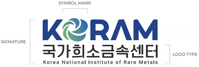
As a symbol of rotation and circulation, the main concept is the circulation of resources.
Lines starting from the center and spreading outward represent the bright prospects and developments of future materials technology.
Visually expressed the importance of resources for a sustainable future and the value of its cycle.
Symbol Mark
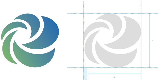
The symbol mark is a symbol that best reveals the formative characteristics and symbolism of the National Rare Metal Center.
Therefore, make sure to follow the rules and principles of applying symbol marksNo image damage, such as distortion, deformation, or misuse, should occur. For readability, it is prohibited to use below the symbol mark minimum size rule.
Minimum size

Logo Type
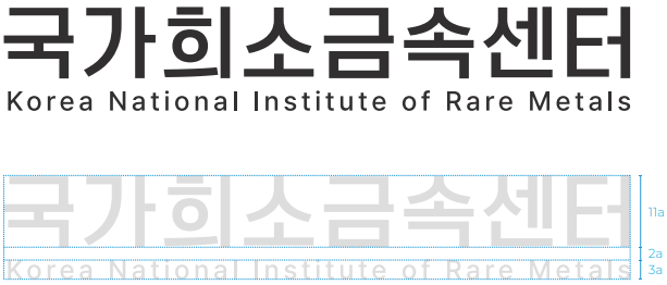
The logo type is the most important symbol that integrates the image of the National Rare Metal Center
It is a representative mark of internal and external visual communication, so special attention is required when using it.
For readability, use is prohibited below the logo type minimum size rule.
Minimum size

Signature A, B

Signature A
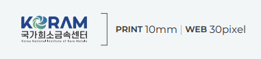
The signature left-right combination type refers to a combination of symbols and logo types in the optimal proportion according to a certain standard, and an appropriate combination should be used in consideration of the application space layout depending on the application medium, but the set principles should be observed for the combination method. For readability, the use of the signature left-right combination type below the minimum size rule is prohibited.
Minimum size

Signature B
The signature top-down combination type refers to a combination of symbols and logo types in the optimal proportion according to a certain standard, and an appropriate combination should be used in consideration of the application space layout depending on the application medium, but the set principles should be observed for the combination method. For readability, the use of the signature top-down combination type below the minimum size rule is prohibited.
Minimum size
Clear space
Signature A
Signature B
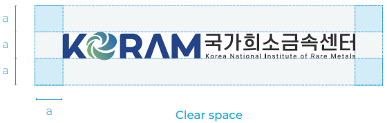
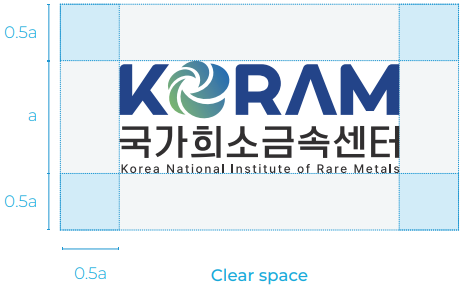
The minimum space regulation is the minimum margin necessary to clarify the distinction between the logo type and the surrounding elements, and other design elements or characters cannot be displayed in the clear space, and an appropriate space must be secured.
Color System
Primary
PANTONE® 287 C
KORAM BLUE
- CMYK 100. 88. 18. 0
- RGB 4. 56. 130
- HEX #043882
Secondary
PANTONE® Black
KORAM BLACK
- CMYK 0. 0. 0. 95
- RGB 0. 0. 0
- HEX #231815
PANTONE® 650 C
KORAM Blue gray
- CMYK 20. 11. 5. 0
- RGB 211. 220. 232
- HEX #d3dce8
PANTONE® 2336 C
KORAM Gray
- CMYK 0. 0. 0. 85
- RGB 76. 73. 72
- HEX #4c4948
Dedicated colors are an important factor in shaping the brand identity of the National Rare Metals Center.
Depending on the characteristics of the applied medium, both primary and star colors can be used. During printing, the PANTONE color and CMYK color must be observed, and the optimum state closest to the illustrated color is maintained.
Color Variation

KORAM Blue gray

KORAM BLACK

KORAM Gray

KORAM BLUE
The use of logo color is a very important factor in the formation of the national rare metal center image.
Depending on the expression medium, it can be used freely within the scope presented, but the use of unspecified colors without any special purpose is prohibited.
Incorrect Logo Usage
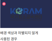
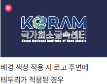
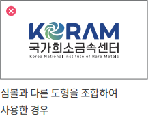
If the shape of the National Rare Metal Center logo is arbitrarily changed, the original image is damaged, so the standard form must be used.
Make sure to comply with the illustrated prohibition of use so that the image can be delivered correctly.
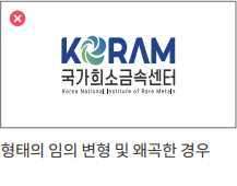
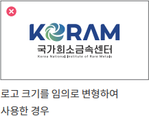
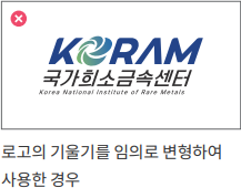
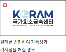
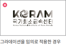
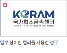

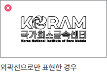
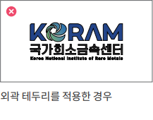
Background Color Usage

black & white background

Color background
It is important to express clearly identifiable when using the color of the logo, and when the Primary Logo is located above the background color, it is used according to the following regulations. If the clarity is inferior depending on the background color, it is applied as white. However, if the clarity is high, the basic color is applied. When applying, consult with the management department.
Typeface Korean
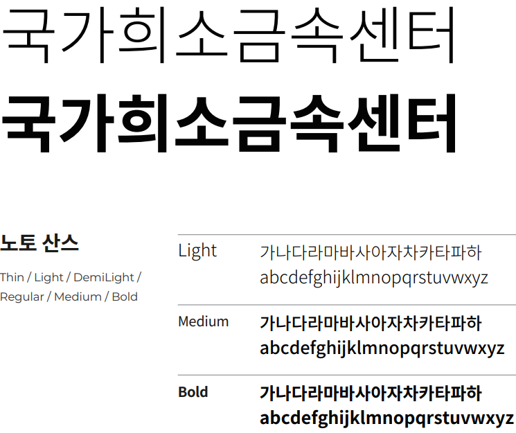
The dedicated typeface of the National Rare Metal Center is designated to maintain a consistent image of various visual transmission media, and in general communication that requires readability, a dedicated typeface should be used.
Typeface English
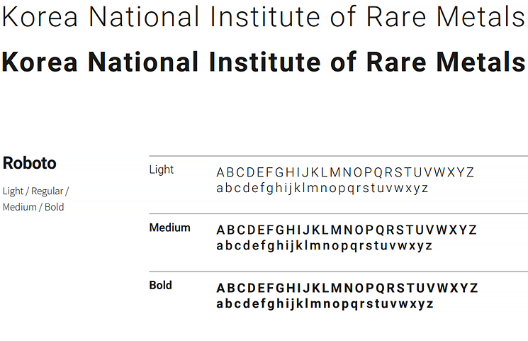
The dedicated typeface of the National Rare Metal Center is designated to maintain a consistent image of various visual transmission media, and in general communication that requires readability, a dedicated typeface should be used.